Team Size: 3 people
Time Period: 3 weeks
Role: Data Visualizer, Dashboard Designer, Front-End Developer
Tools: D3.js, Sketch, SVG
As a project for my Interaction Design Studio 2 class, we were asked to create a dashboard that displays biodiversity information to make it easier for policy makers to make decisions. For this project, we chose to create a webpage that uses a combination of svg generated from the vector program Sketch for the static graphs and D3.js for animated graphs.
Dashboard Design

A dashboard is a centralized location for information that an individual consults in order to make informed decisions. Let's put that into perspective. If you're like me who drives a manual, you might check if the rpm (revolutions per minute) of your engine is high enough to warrant a gear shift up. If you decelerate quickly and need to shift into a lower gear, you probably look at what speed you're at to make that decision. You get all of this information from your car dashboard.
For a dashboard to be effective, it must:
- — Provide all of the information a person needs
- — Make the information it's providing very easy to understand
- — Provide the right information at the right time
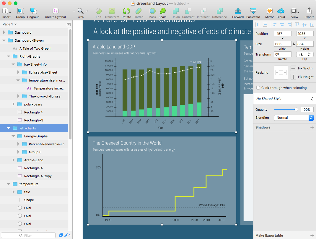
The Greenland Dashboard

For this specific project we needed to create a dashboard that will display climate change and biodiversity information for Greenland. This information will be used by policy makers to make informed decisions on policies that may directly or indirectly affect the environment.
The challenges we had to face for this project were:
Information Heirarchy and Organization
- — What kind of metrics makes sense for the given context?
- — How can we take advantage of position to attain effective progressive disclosure?
Data visualization
- — How can we use sight, the human sense with the highest bandwidth, to make it easier to interpret the information?
Animation
- — How can we show relationships between metrics through animation?
- — How can use animation to create a sense of urgency whenever a metric crosses a critical threshold?
Challenge 1: Choosing the right metrics
Before we can make a dashboard that displays information, we first need to figure out what specific pieces of information to display. Imagine seeing an indicator on your car dashboard that tells you how many peope are currently seated in your two seat sports car. I’d imagine that that’s not very useful.
So for our domain we chose metrics that make sense for Greenland:
Salmon Population
- – Salmon naturally migrates to Greenland and can be easily affected by human activity
Firn saturation
- – The amount of melted ice captured in the firn is a good thing to monitor because if it reaches a certain threshold that means that melted ice will start escaping to the ocean, possibly increasing sea water levels
Ice Sheet Size
- – A good indicator of how much ice has melted over time is how the shore line of the ice sheet has changed through the years
GDP vs Arable Land
- – When ice melts, more land gets exposed. This land can be ripe for agriculture which lends to an expansion of a market that might increse the GDP of the country
Temperature
- – Almost anything from salmon to ice melting to human activity can be affected by temperature, so it's pretty important to have this on the dashboard
Bear Encounters and Killings
- – Changes in its natural habitat can drive bears closer to cities which might result in them getting shot
Challenge 2: How do we visualize?
Highlight: I did some initial sketches on paper for an idea of how we wanted our dashboard to look like. When we struggled a bit with how we would take the feedback we got to get to a direction we wanted to take, I created a mindmap of our best idea so far to get us all on the same page.
Iteration 1: Greenland Customer Journey Map

"It's hard to take seriously because it looks childish"
Our first attempt at a "visualization of data" was quite literal. We took the data about salmon and made bar graphs out of fish icons, each black fish representing an arbitrary unit of salmon and the red fish representing a threshold. While cute, the feedback that we got from it was that it was hard to take seriously because it looked childish. It woud look good for a science exhibit but not as a dashboard meant to be used by policy makers. So if we want to be taken more seriously we needed to look more scientific.
Iteration 2: Good Old Bar Graphs and Maps

Whiteboard brainstorming of visualizations for our metrics
So we toned down on our icons and went a little more scientific by using traditional bar graphs and maps. We did a couple of iterative sketches on paper and had people take a look at it to see if they are getting what the graph is trying to portray. And sure enough, traditional graphs were both easy to interpret and more porfessional looking.
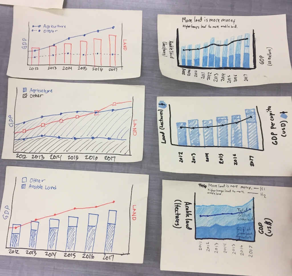
Iterations of the GDP and arable land graph.
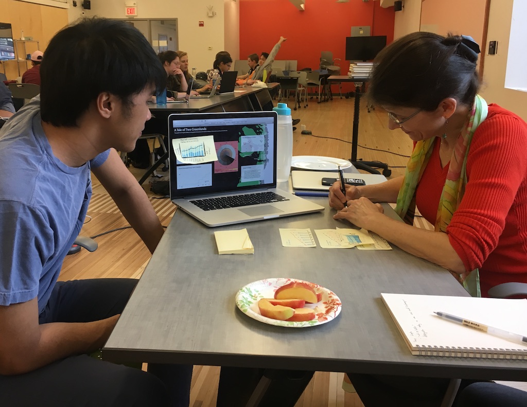

User testing with our professor and a fellow student.
Challenge 3: Is our narrative powerful?
This Greenland dashboard was meant to dictate the creation of policies that will affect not only Greenland but also other countries as well. While we could track the firn and salmon population, we felt that it’s connection to the narrative as a whole was weak. We felt that we had good visualizations, but we needed to present a stronger narrative. We needed to drive a better story.
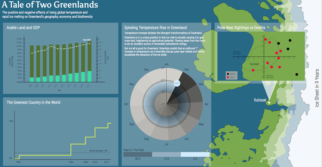
Iteration 3: Tale of Two Greenlands
Highlight When deciding what our narrative would be, there was a point where we were throwing out ideas but weren’t actually committing to any of them. It was then that I decided to create a mindmap of everyone’s input so that we can have an artifact to look at and modify. This would eventually shape our final narrative.
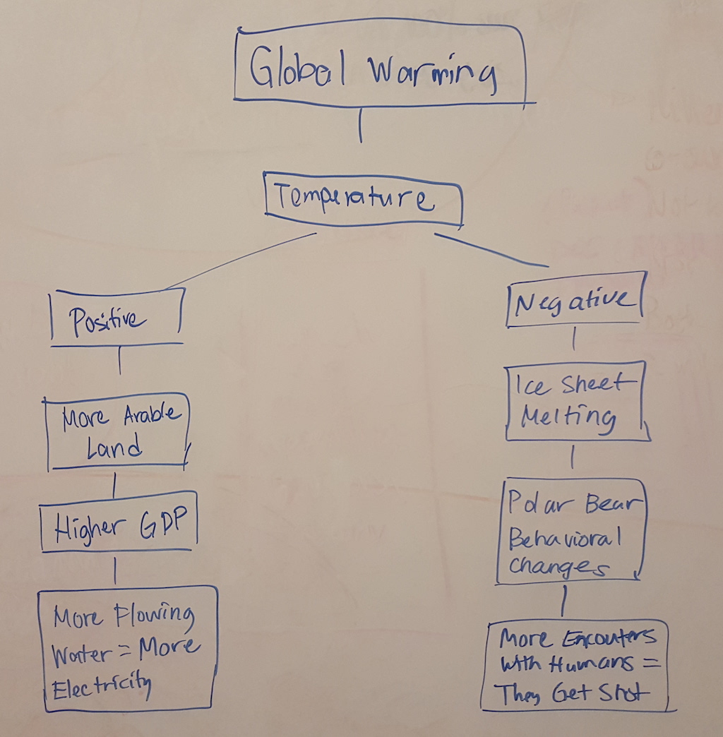
Our narrative at its core.
When you think about Greenland, it’s inevitable that you talk about temperature and global warming. While thinking about what story our dashboard can be telling, we played with this idea looking at global warming from two perspectives — that while people tend to focus on the negative aspects of global warming, with the renewable energy and increased GDP from arable land, Greenland itself is actually gaining a few good things out of it. The positive side of global warming. And thus the idea of the Tale of Two Greelands was born.

Laying out what it would look like.
The idea was simple. We had temperature as our main metric. Since it directly affects all of the other metrics, we wanted to put it in front and center. Next we put all of the positive effects of temperature on one side and the negative on the other.
Implementation
Highlight I flexed my web development skills by creating a website with javascript driven animations instead of a video to showcase what our dashboard would look like.
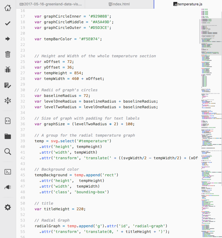
D3, or Data Driven Documents, is perfect for creating web documents that are, well, data driven.
When it came to actually creating the dashboard, we were required to show some animations, something that would make Adobe fans think of After Effects immediately. But we were doing this project during a time when I was learning data visualization and the corresponding javascript library, d3.js from another class. Since we were doing data visualization for this project I figured I could do this project in D3 as well to get more familiar with the library — effectively hitting two birds with one stone.
Static graphs in Sketch
Of course since not all of my teammates are learning d3, we decided to use sketch as well so that they can work on creating the static graphs. And since sketch can export to SVG, and d3 is a library built around creating and manipulating SVG, it was perfect.
Implementation Highlight 1: Temperature Graph
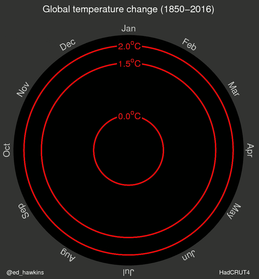
If we wanted to tell people that global warming is a thing, a line graph of average temperature change during the past 12 months showing a slight dip during the summer months that then stabilizes back to a baseline isn't really that convincing. What we would want to show instead is how that baseline has been shifting higher and higher through the years. So we searched for existing visualizations and found this particular one by Ed Hawkins.

Click to expand
Pulling from multiple examples online, I was able to recreate a similar looking graph in d3 but modified to accommodate a few project requirements we had to incorporate into our dashboard:
Showing Real-time Data
- – For demo purposes we changed the time scale so that one second represents a day.
Crossing a Threshold
- – For our case we set 1.0 degrees as our threshold and blinked the background red whenever the graph crossed that threshold.
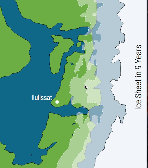
Implementation Highlight 2: Ice Sheet

Sketch of our initial ice sheet visualization
Our initial visualization for the ice sheet involved showing the ice sheet shrink over time in comparison to Greenland as a whole. We chose this visualization at first because we wanted to put Greenland in the center of the dashboard.
Click to expand
But since we shifted to temperature as our main metric, we chose to crop the ice sheet off and show just a small part of Greenland. It actually kinda worked out well because the shrinking of the ice sheet's shore line looks a lot more dramatic when zooming in to a particular part of Greenland.
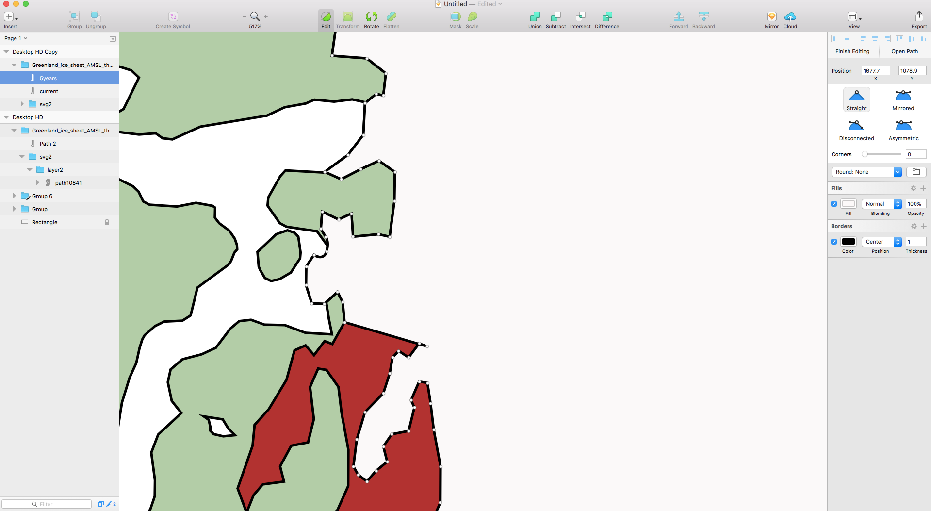
Using Sketch to edit the individual vertices of the Greenland SVG
Click to expand
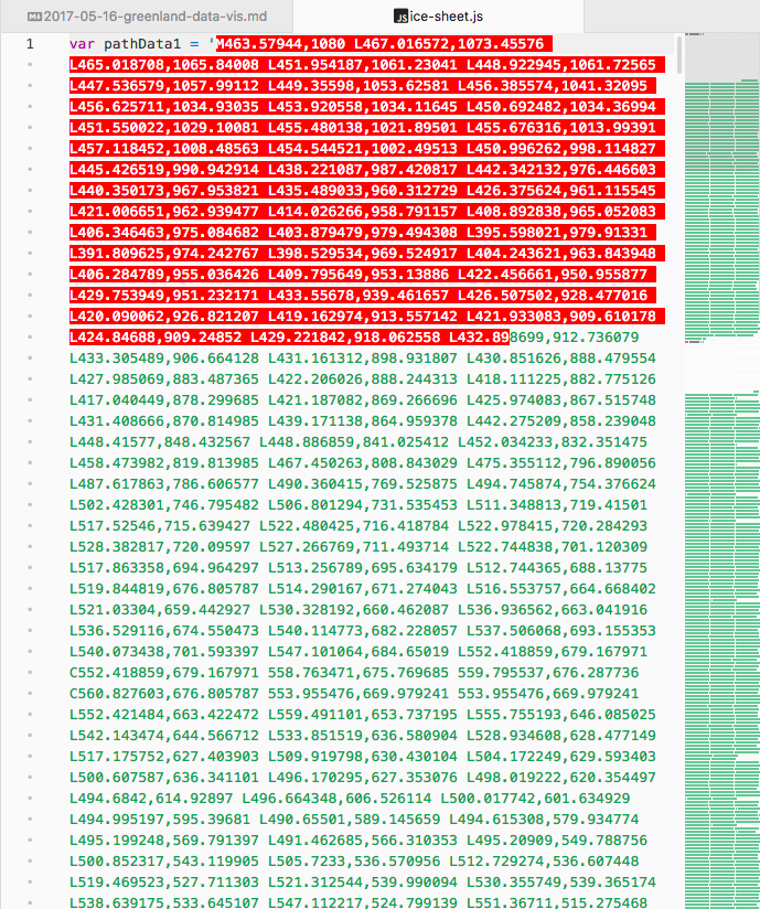
Animating the ice sheet wasn't that difficult, really. It just involved getting an SVG of greenland, editing the vertices to make it look like the ice sheet has moved, exporting the resulting shape into an svg, and parsing the d attribute from the svg and feeding that into d3 to animate.
Final Dashboard
Click on the picture to view live website.
And now I present our final product. There’s nothing much to say, really. Click on the picture (or here) to see the live website.