Role: Designer
Tools: Adobe InDesign, Adobe Typekit
As an exercise on document design, we were given a writeup about industrial ecology and was tasked to create a presentable document aimed at making Dow employees more conscious of industrial ecology and the role that they play in it.
Branding
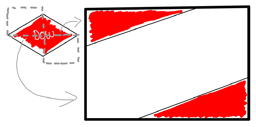
To start off, I used the Dow logo as an inspiration for the overall design of the spread. The shapes created by cropping the diamond edges as well as the usage of the Dow logo’s red color create a sense of familiarity with the brand.
Layout & Consistency
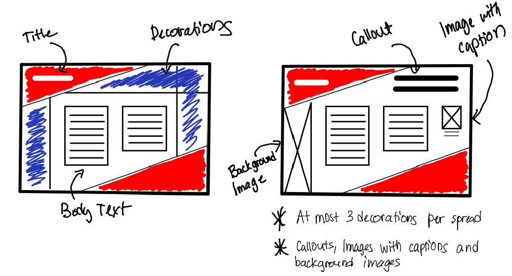
I decided to group the layout into three main parts: title, body text, decorations. The title set the overall theme of the page. The decorations (which include callouts, images with captions, and background images) all give supplementary information and/or serve as a backdrop for the theme. The body text is, of course, where the meat of the document is.
The grid I chose to go with was pretty straightforward: title on the top-right, decorations on the margins, and body text on the center. This gave a consistent organization of information, making it easy to flip and skim through when you are looking for something.
Shaking Things Up
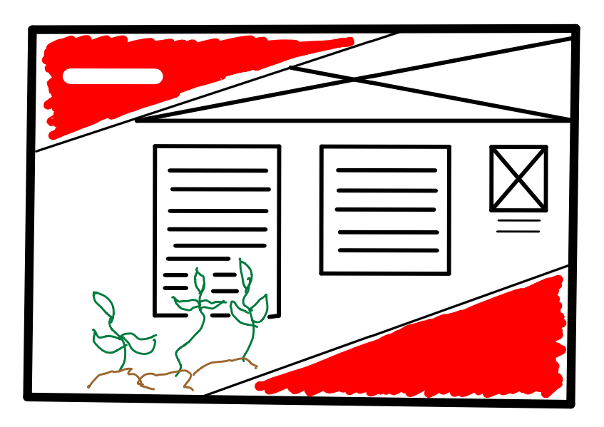
To add variety and break the monotony of the uniform design, I had one of the pages break the body text using an image.
Final Product
Well, here’s the final product. I don’t have much to say about it, really. Click on the image below to see the whole thing.
Click on the image to view full pdf document